WellnessLiving Inspired to Enhance Tesla’s New V11.0 Dashboard Design

Did you know WellnessLiving’s Co-Founder and CEO Len Fridman loves his electric cars? It’s true—he’s a big fan of Tesla, he owns the Model Y, Model 3, and has ordered the Model S.
Why is this important? Len’s passion for Tesla is reflected in the new redesign of our App Drawer and Top Navigation Bar from the browser version of WellnessLiving. The simplistic look and feel were inspired by Tesla’s sleek and minimalist interface and toolbar from their touchscreen dashboard.
At WellnessLiving, we’ve taken that design one step further, allowing you to customize the App Drawer by pinning the most-used apps for staff members. The View All icon is another option for a list of all our apps.
In December, Tesla updated their V11.0 in-car dashboard software. After reviewing the system, we noticed three issues with the design:
- The driver profile can sometimes confuse which user is connected to the car.
- Heated seats and front and rear air system require extra touches to access.
- Settings for certain features like headlights and windshield wipers are hard to find.
The five-day process
That’s when our UX/UI design team stepped up and saw an opportunity to improve Tesla’s touchscreen dashboard and bottom toolbar with greater customization and functionality. In the process we used the GV Design Sprint, where over the course of five days, we spent an hour each day researching, brainstorming, prototyping, and testing out our ideas.
The solutions
At the end of the five days, our team found solutions to each problem:
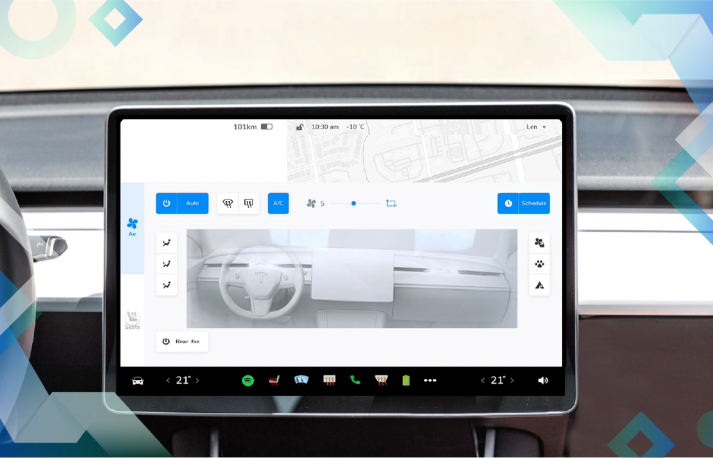
We added a user profile dropdown menu option at the top right corner of the touchscreen, allowing you to conveniently select a driver or add another profile.
We reduced the number of touches required to turn on your heated seats and front and rear air system, allowing you to add heated seats, front defogger, and rear defogger controls to the bottom of the toolbar.
Inspired by our custom App Drawer, we gave users the ability to customize the touchscreen by featuring their most-used apps and letting them rearrange their apps anywhere on the bottom of the toolbar.
We love Tesla and there’s a lot we’ve learned from them. We’re thrilled to apply some of our great innovations to the Tesla V11.0 in-car dashboard software. For the full case study, visit: uxplanet.org


